M1 Finance Homescreen
Design Lead | Jan - Apr 2022
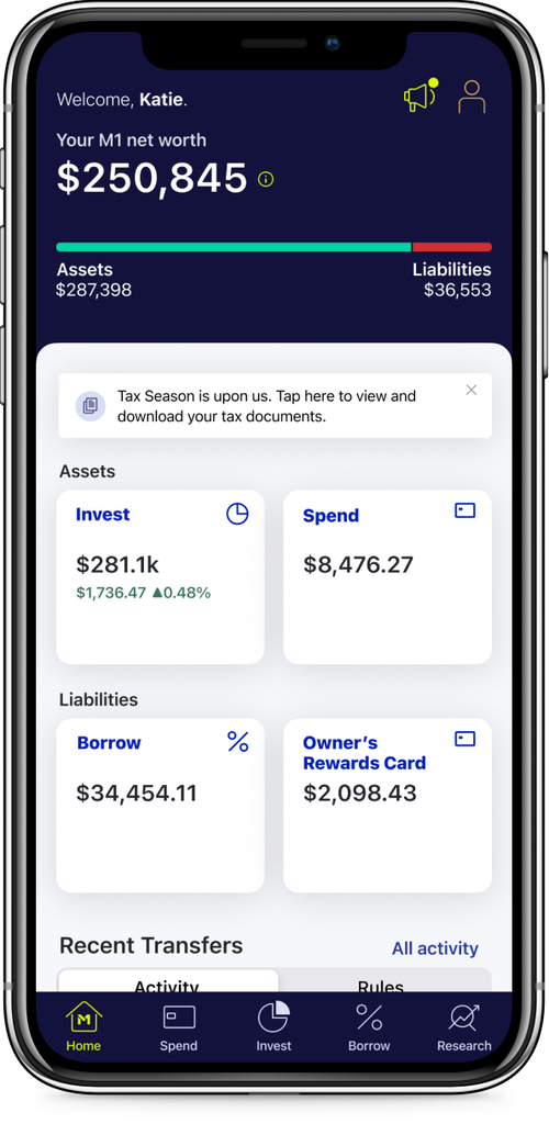
I led design on a new home screen that provides users with quick access to their accounts, a clear view of their finances, and intuitive pathways to explore everything M1 offers.
Context
The company aimed to better distinguish its products, making it easier for users to onboard through the path that best fits their financial goals. The new home screen surfaces high-level insights into a user's financial picture while also introducing relevant M1 products to support cross-sell opportunities.
Business outcomes
Increase products per user (PPU)
Increase assets under management (AUM)
Increase active users & customer happiness (as measured by NPS)
Product outcomes
Help users understand the status of their accounts & high level financial picture
Communicate the holistic M1 value prop
Build trust between users and M1
Sprint details
Given the significance of this project and its impact on users, we had the opportunity to run a full Google Design Sprint over four days.
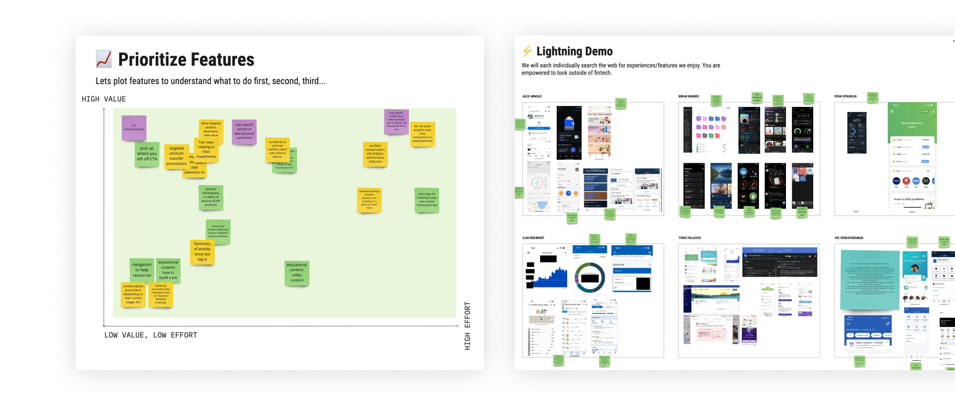
A snapshot from our stakeholder discovery workshop, where we aligned on business and product goals, generated and prioritized features, and ideated enough to confidently move into the design phase.
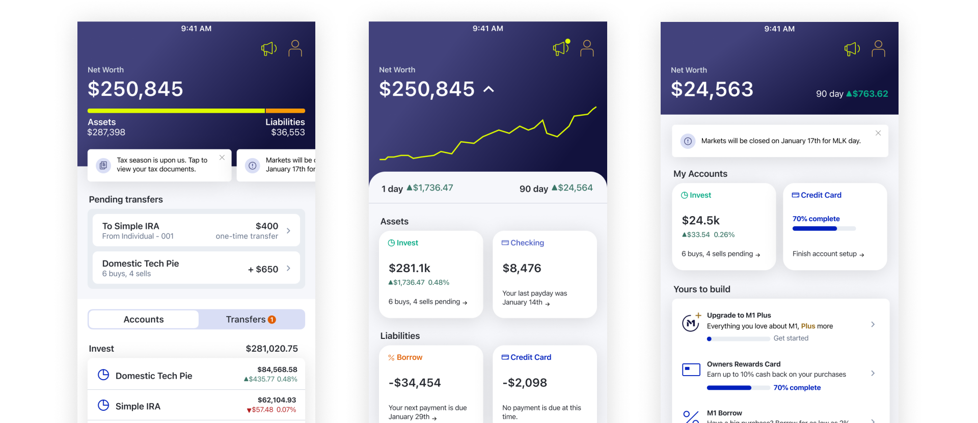
The day after our discovery workshop, we created three mobile prototypes to test multiple variations of the same features and gather nuanced feedback from participants.

Above are the participants we tested with, arranged along a spectrum of financial expertise. Gathering feedback from both financially savvy and novice investors was crucial. Notably, three of the four participants had previously expressed interest in an dashboard home screen before our sessions.
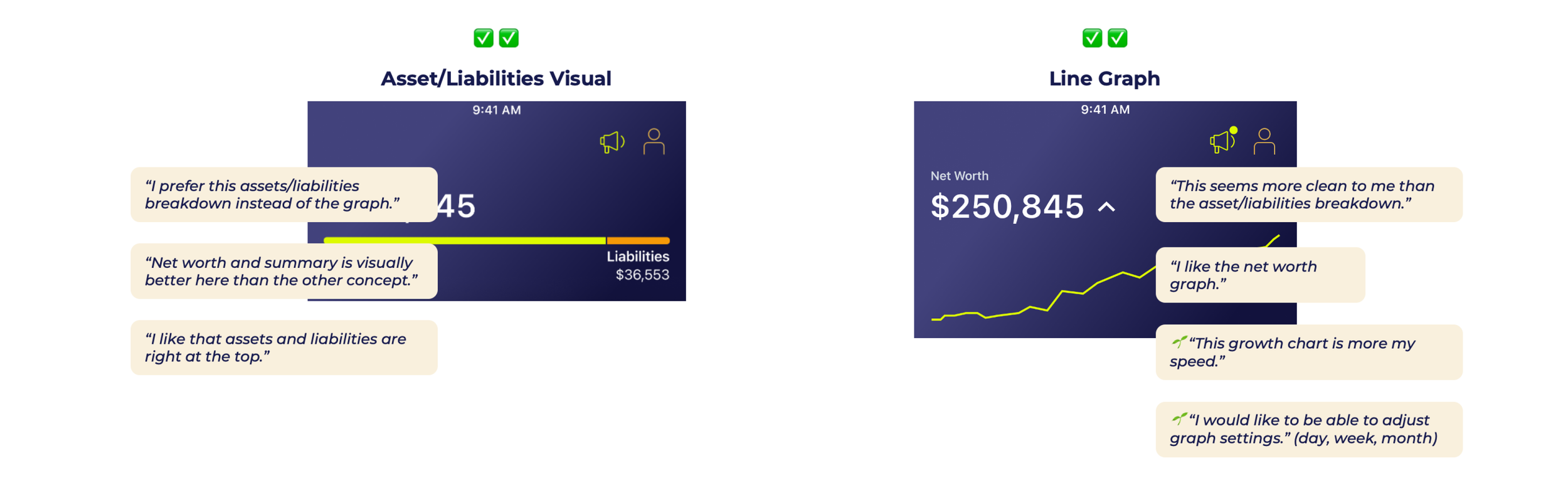
We experimented with various ways to visualize a user’s net worth and the breakdown of assets and liabilities over time. Users showed no clear preference between the options. Ultimately, we chose the bar chart after learning that engineering would need three months to build the line graph, as the historical data had not yet been formatted on the backend.
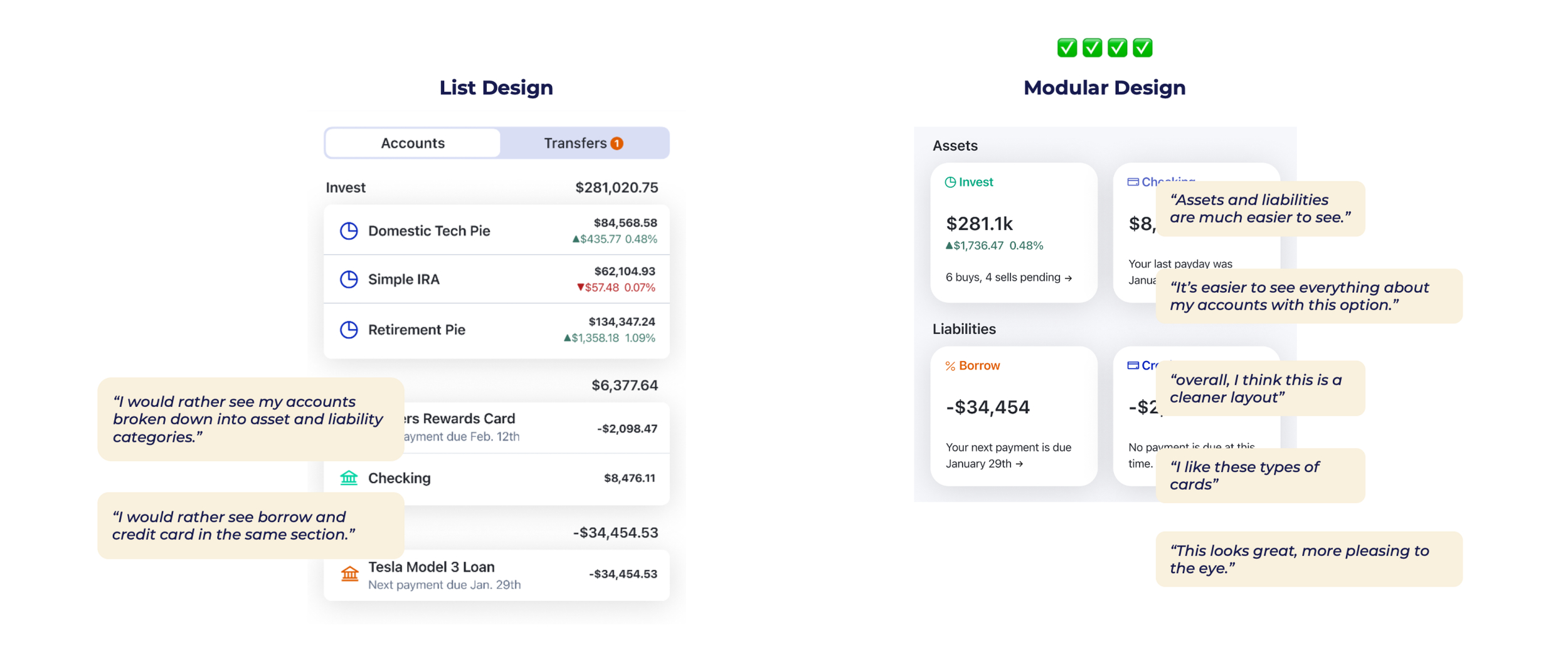
When visualizing accounts, users clearly preferred the widget pattern over the balance sheet. This surprising insight highlights the value of testing. The design on the right was seen as easier to digest, featuring a cleaner layout, and users appreciated the clear asset and liability categories.
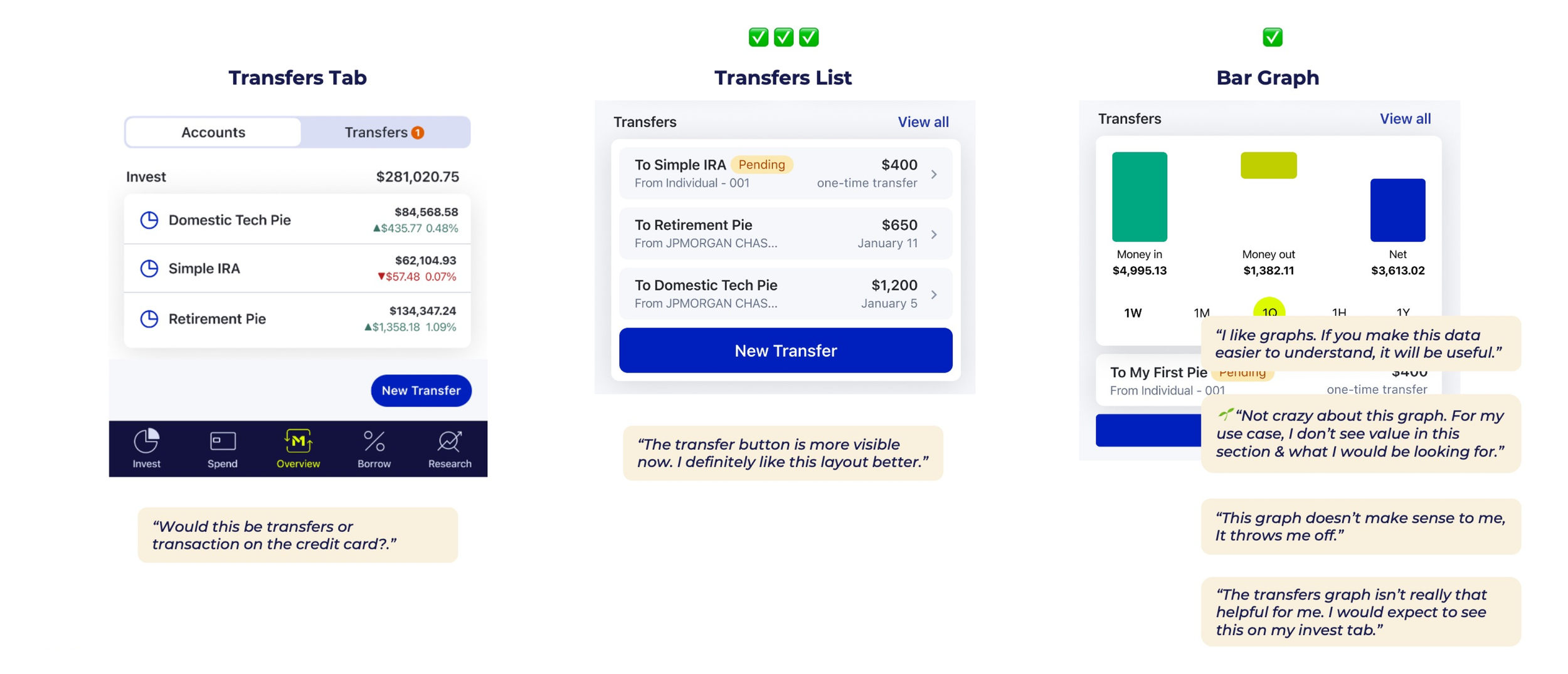
We knew a transfers component was essential on the home screen since it was removed from the footer navigation. The transfer list stood out as the clear winner thanks to its easy-to-understand layout and the prominent ‘New Transfer’ call-to-action.
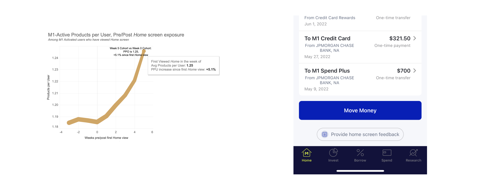
Since release, we’ve gathered valuable data on user behavior and taps, alongside open-ended feedback collected via a form at the bottom of the screen. Combining quantitative and qualitative insights has greatly improved our ability to prioritize future feature releases.
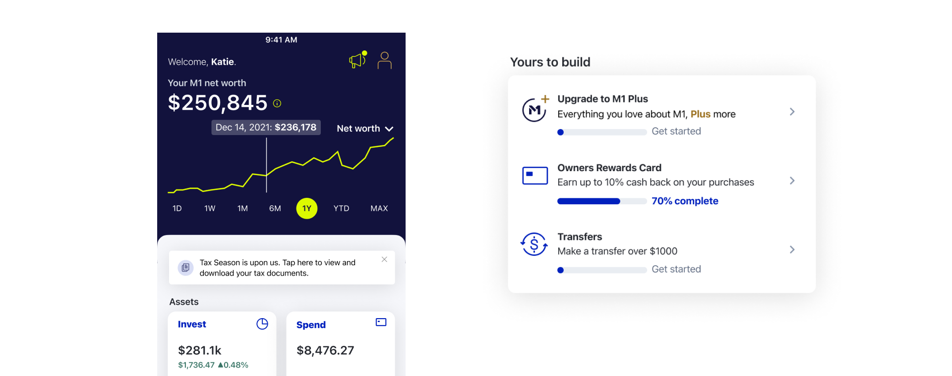
Looking ahead, we’ve explored adding a net worth graph and a ‘Yours to Build’ section to encourage users to engage more deeply with M1’s product offerings.
Next, we were also tasked with revamping the information architecture (IA) of the web experience.
By reimagining the information architecture across the entire M1 platform, our goal was to create a simple, intuitive experience for users seeking to optimize their workflows.
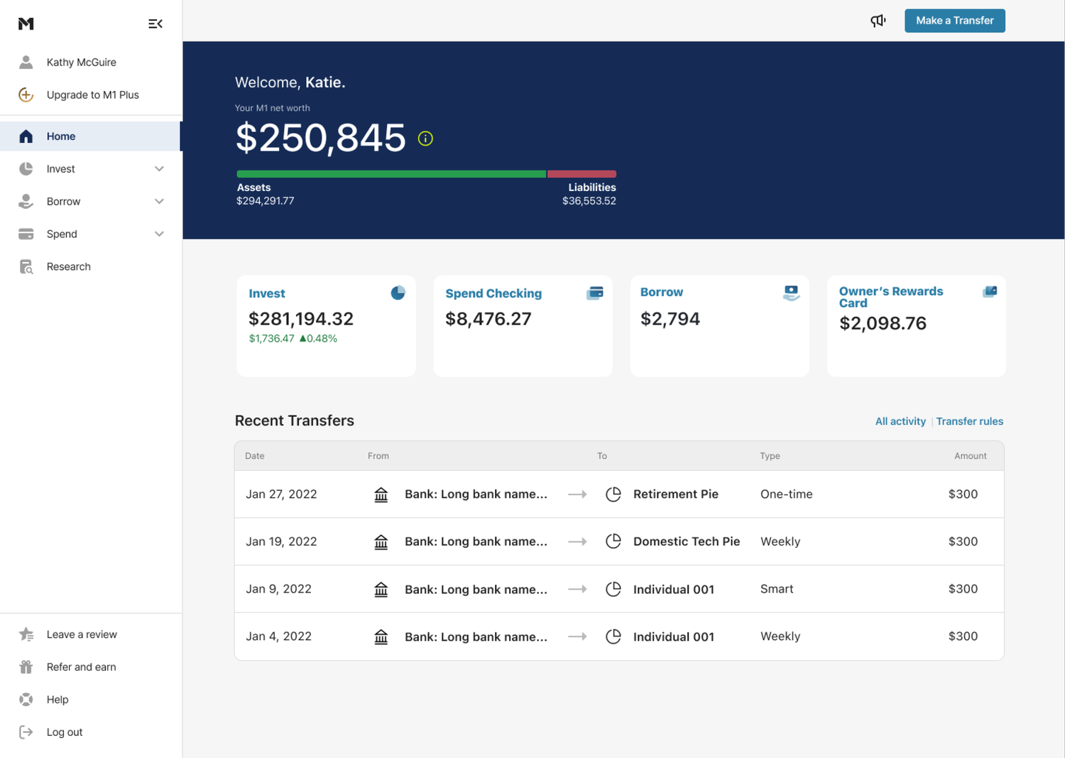
Context
The M1 app was developed in stages, resulting in products and flows that don’t always follow consistent patterns. Additionally, smaller features were added to existing structures rather than designed from first principles, leading to a fragmented user experience.
To address this, we are reorganizing all top-level features and flows into a simple, intuitive, and scalable information architecture framework.
Business outcomes
Improved product visibility and workflows
Rollout updated branding with premium look and feel
Product outcomes
More intuitive money management
Build trust with users
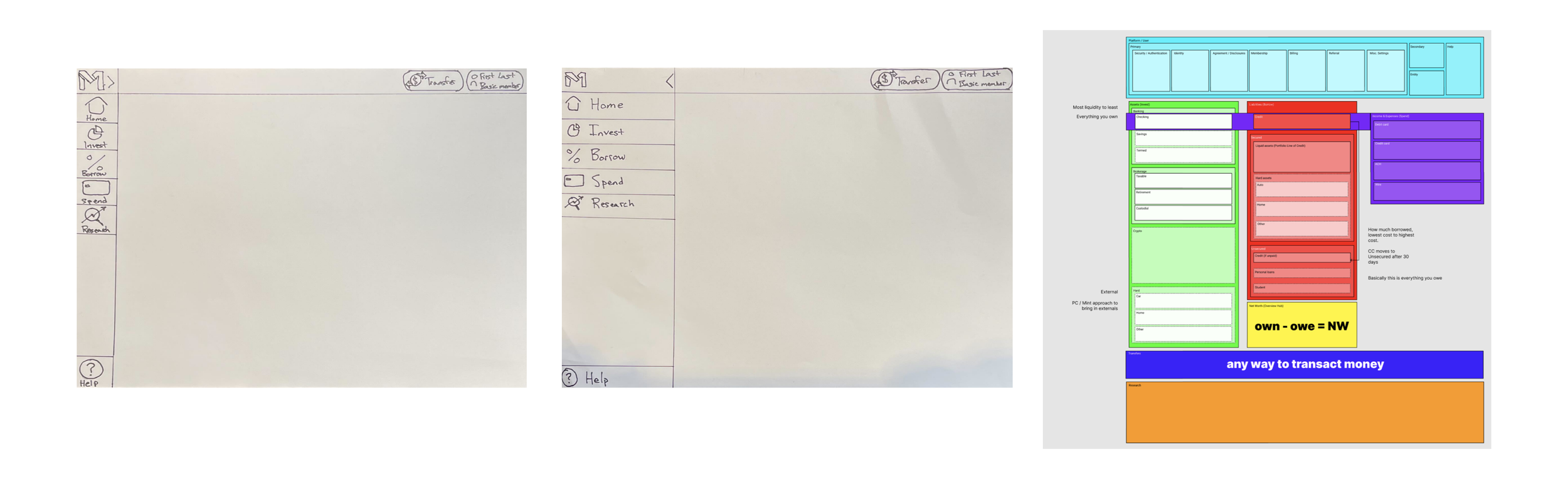
The CEO of M1 asked me and another designer to take on a major project: restructuring the entire information architecture of the M1 platform. As a systems thinker, I thrive on design challenges like this. Above are a few screenshots from our discovery sessions that helped us focus the direction for the new IA.
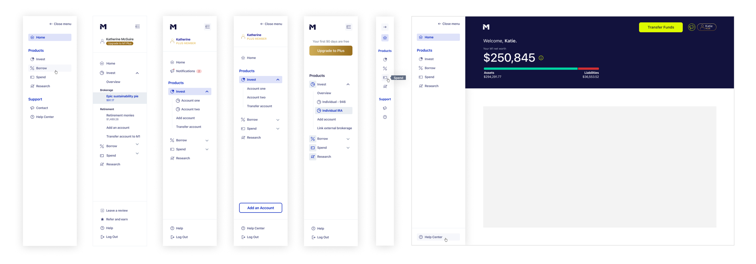
We knew we wanted to move forward with a side navigation, above are just a few of the dozens of explorations we reviewed.
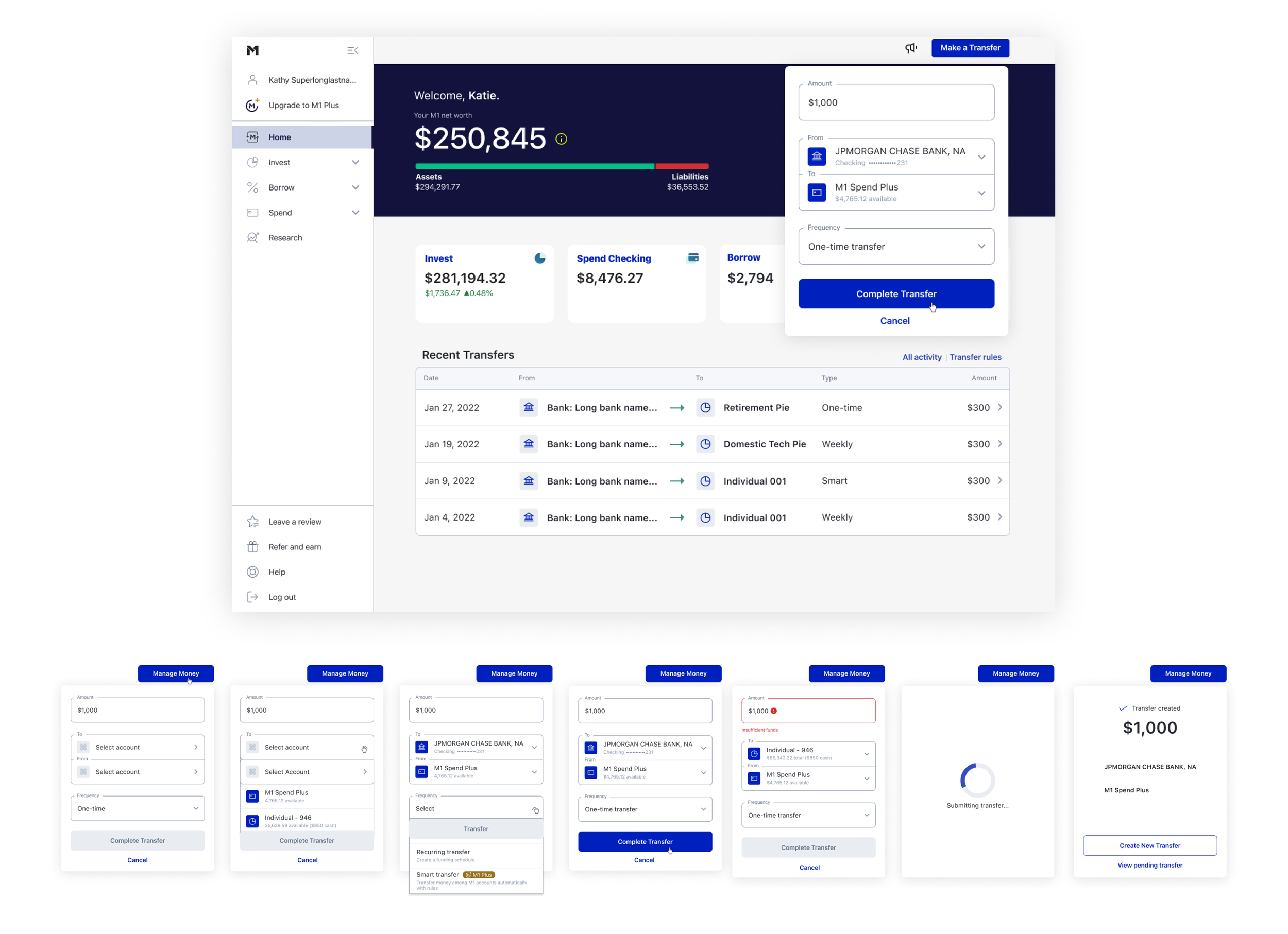
We also knew we wanted a universal transfers drawer that could be accessed from anywhere on the platform. Since moving money is the primary action we want users to take, making this workflow seamless was a top priority.
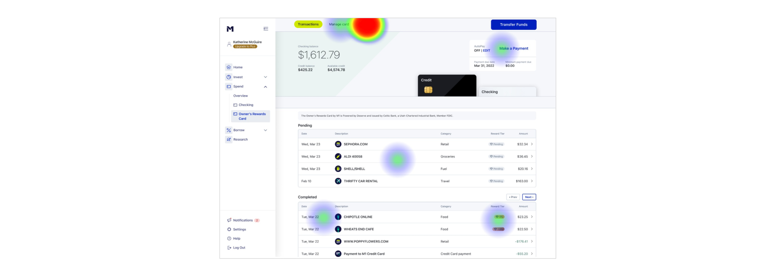
We used Maze for automated user testing, above is a heatmap generated from one of the prompts we gave users.

There were just as many conversations about wording and vernacular as there were about visual design. When we polled users, they shared valuable feedback on how the transfer action should be communicated across the platform—insights we heavily considered while collaborating with our UI copywriter.
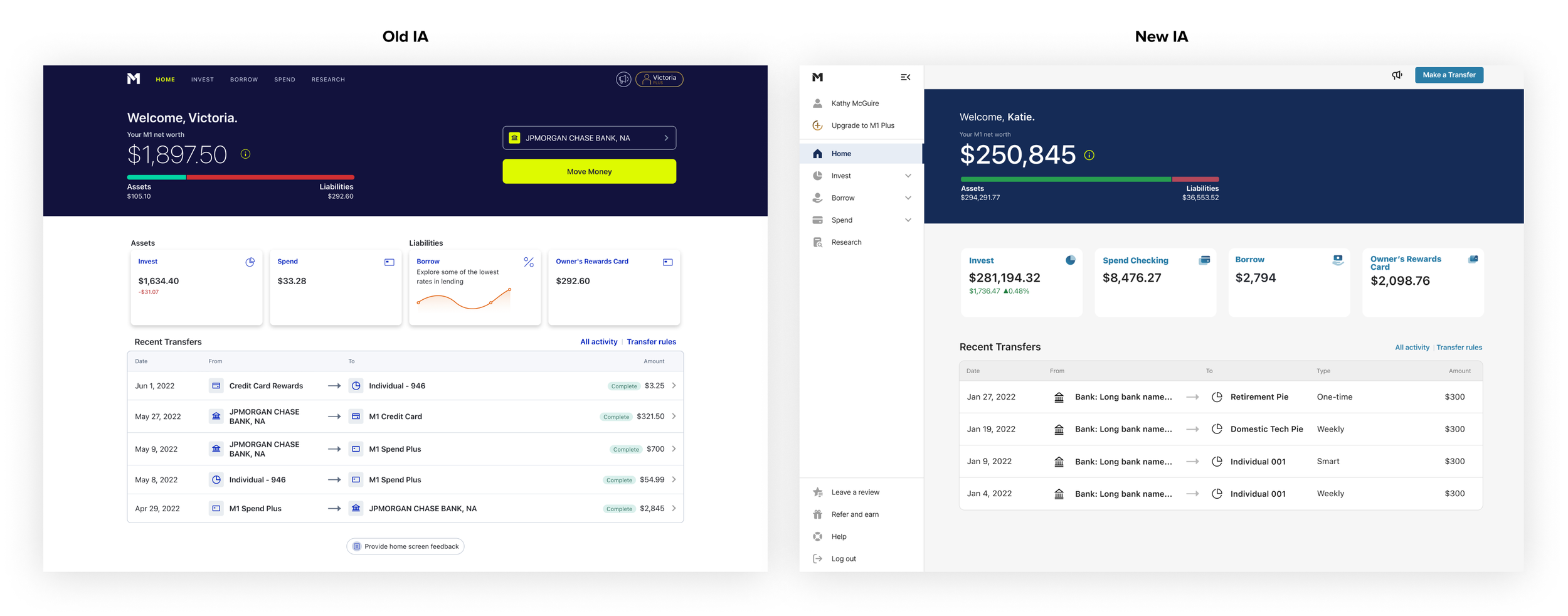
The image above displays the evolution of the M1 platform.

M1 offered a robust suite of financial products, but low awareness meant most users only utilized a single offering. I designed contextual discovery surfaces across the core platform, seamlessly exposing relevant products within existing user workflows.
This strategic UX overhaul directly drove an ~18% increase in products per user, establishing design thinking as a primary driver of core business metrics.